MY ROLE
As Product Manager:
- I worked closely with the IT team to take the application from conception to launch;
- I worked with UX/UI designer to the best user experience by exploring many different approaches to solving end-user problems;
- I created flows on Miro to help define the user experience;
- Together with the CPO, I prototyped the entire redesign of the app, by analyzing competitors and defining priorities;
- Together with the CPO, I prototyped the entire feature of the DCPs
- I coordinated the communication among all the different departments;
- I wrote user storis.
As a Quality Assurance Manager:
- I coordinated the test by leading a team of 6 people;
- I tested the application to ensure high quality standards were met;
- I definde the acceptance criteria.
THE PROJECT
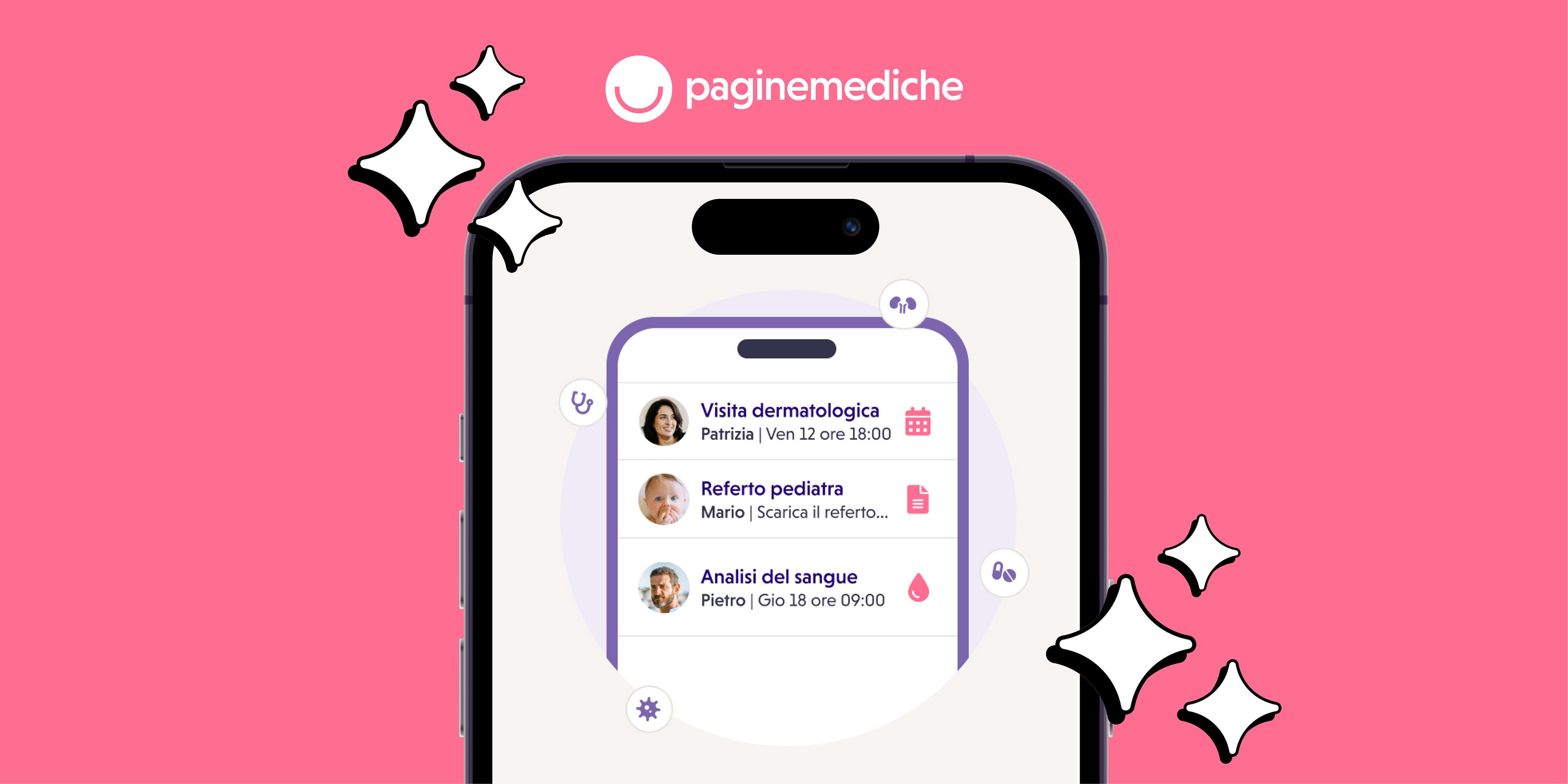
As Product and Quality Assurance Manager for Paginemediche, I was entrusted with the task of leading the restyling project of our Paginemediche booking app (Visitami).
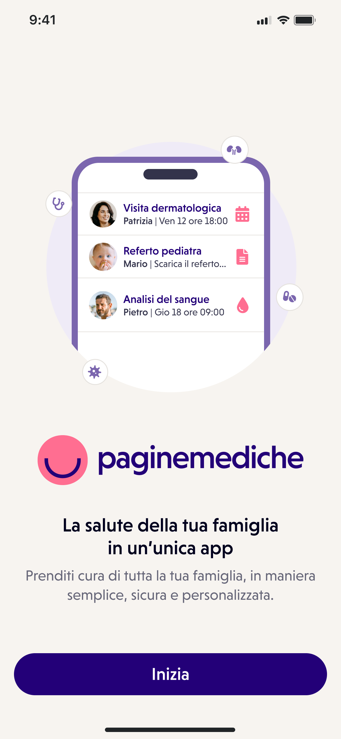
The goal was to revolutionize the way patients book appointments and access medical information, making it easy and at their fingertips.
Working on such a huge restyling project was a real challenge. First of all, because we weren't just redesigning the application: the goal, in addition to improving its UX, was to understand what was missing, what was too much and how to implement these changes, while respecting the already existing backend flows.
So we asked ourselves two questions: what is missing from the application? What, on the other hand, can we do better and how?
We answered this questions in two phases.

PHASE 1: THE REDESIGN
The first phase was about the redesign, answering the question what can we do better and how? So, the goals were:
- Enhance user experience by making the application more intuitive and pleasant without changing existing booking flows
- Update the interface and user experience of the application in accordance with new brand guidelines
- Boost user engagement by improving usability and encouraging more frequent and consistent usage of the application
PHASE 2: THE DCPs
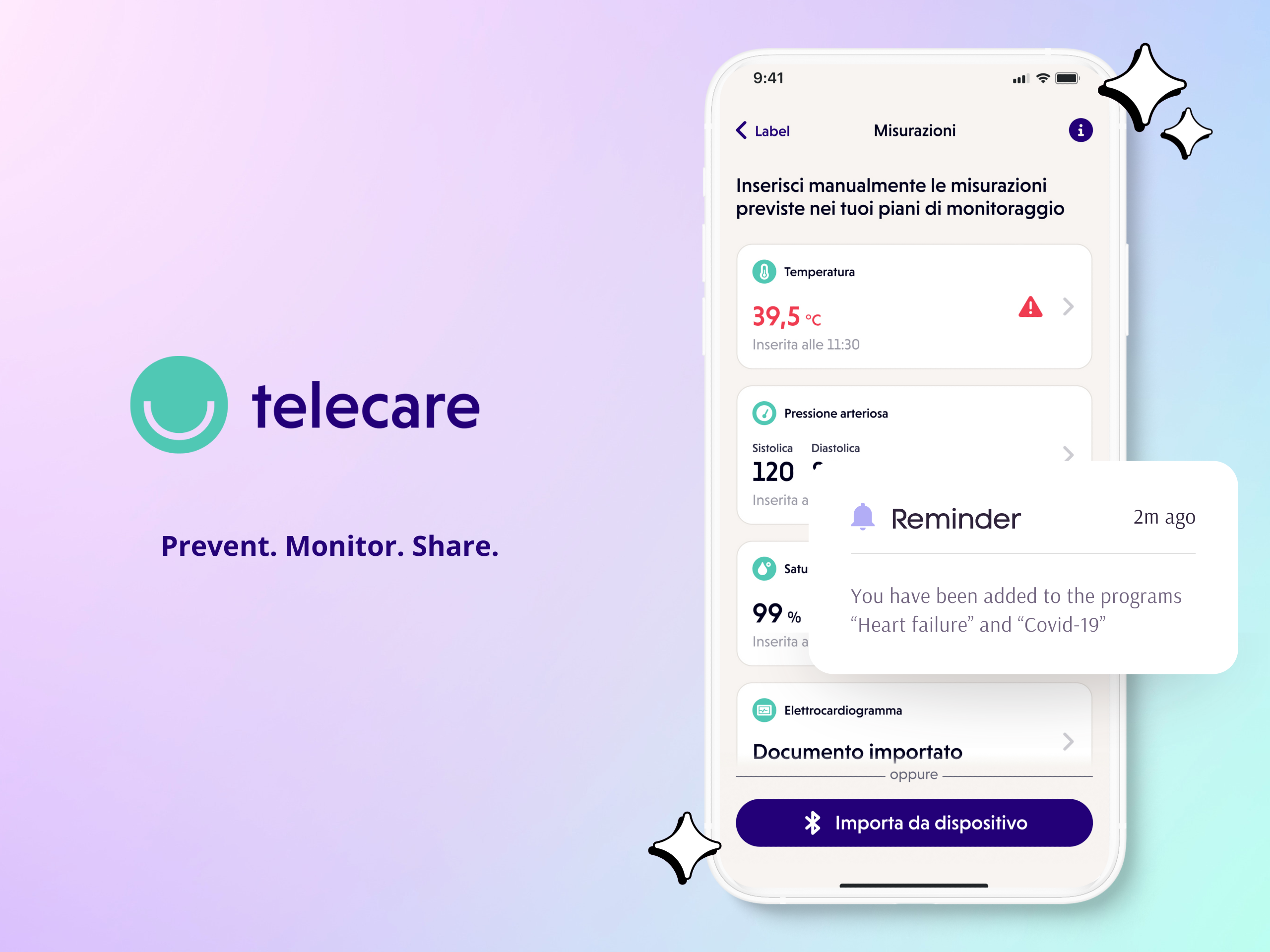
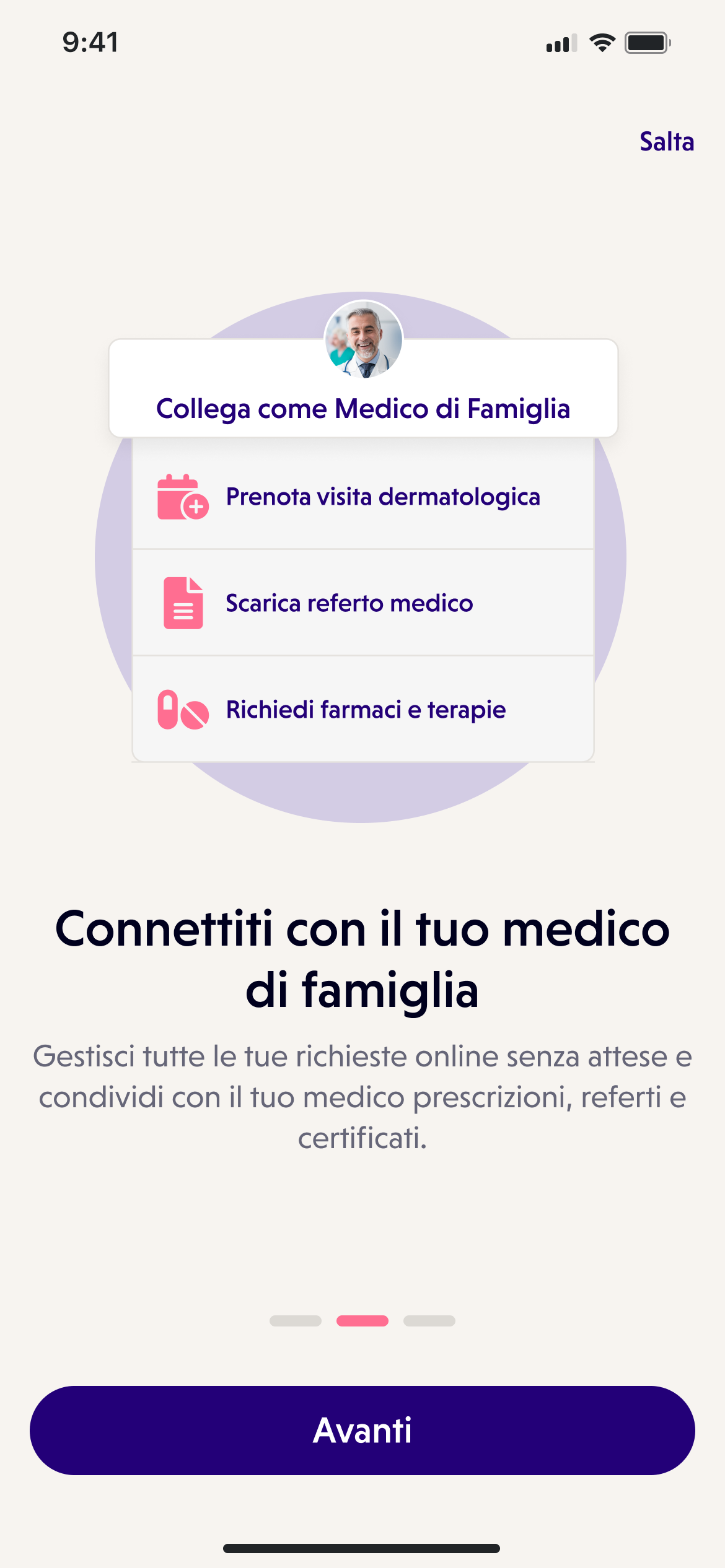
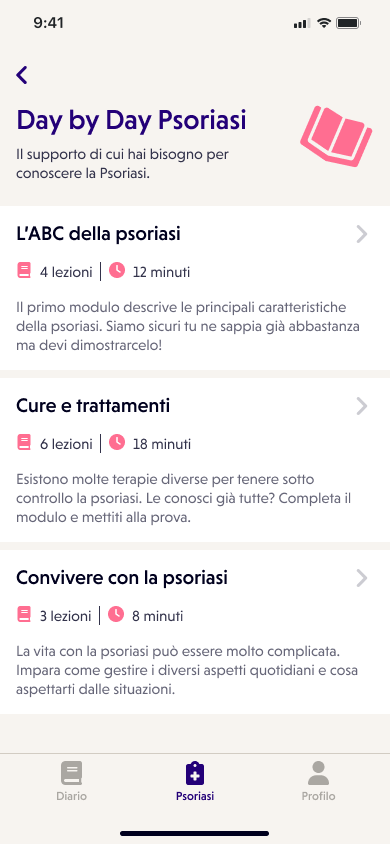
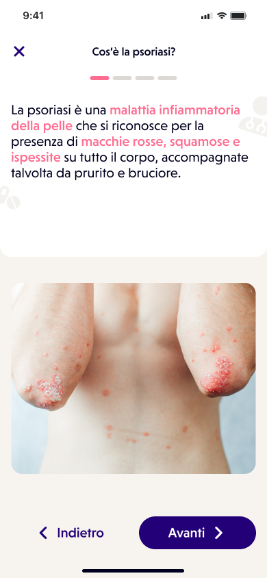
After completing the app's restyling phase, I focused on implementing Digital Care Programs (DCPs) within the application. These programs offer personalized care pathways designed to help patients manage their specific health conditions through exercises, therapies, and other activities. With DCPs, users can choose to follow their care plan independently or with a doctor's assistance, providing them with more convenient and accessible healthcare support.
DCPs have several advantages in disease management, including encouraging self-awareness and providing continuous support to help users manage their symptoms more effectively.
To achieve our goals, I identified the following key activities for the second phase:
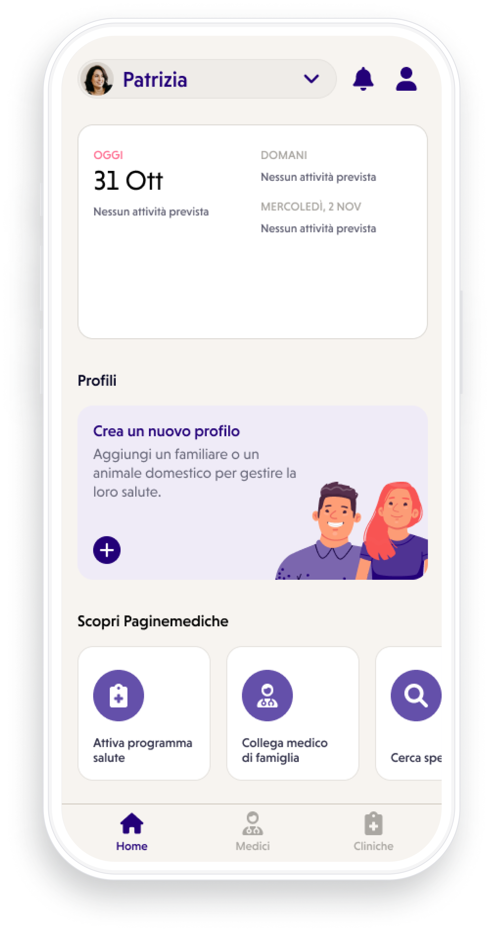
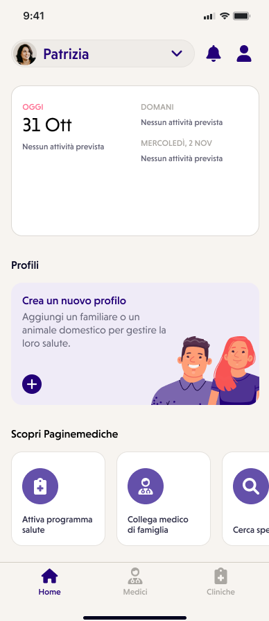
- Implemented a home section within the app that allows users to easily access relevant information such as the activity diary, future bookings, and active DCPs. This feature increases user engagement and helps users keep track of their appointments.
- Added a dedicated section for health programs (DCPs) that allows users to start specific programs based on their needs. The section also displays active DCPs, which helps users track their progress in achieving their health goals. This feature not only improves usability but also encourages more frequent and consistent usage of the application.
- Improved the overall user experience by providing personalized and convenient healthcare support through DCPs. DCPs encourage self-awareness and provide continuous support to help users manage their symptoms more effectively, making it a revolutionary tool in disease management.
THE PROCESS
I started by mapping out the existing app and all of its competitors. This involved creating detailed streams on Miro of the different features and functionalities of the competitor app but also of Visitami. By analyzing these streams, I was able to identify the best features and functionality of each app and incorporate them into our redesign.
I knew that to make a real difference, we needed to design an app that not only made it easy for patients to book appointments with doctors, but also gave them the information they needed to manage their health.
I knew that to make a real difference, we needed to design an app that not only made it easy for patients to book appointments with doctors, but also gave them the information they needed to manage their health.
We conducted research on the current state of the healthcare sector and identified the main pain points for patients. Through this research, I discovered that one of the biggest challenges patients face was the lack of easy access to medical information and resources, which led us to the hypothesis of DCPs.
After mapping out and analyzing competitors, I worked closely with a team of expert UX/UI designers, using prototyping tools like Miro and Figma to create detailed flows. We focused on creating an intuitive and user-friendly interface, aiming to make the app as easy to use as possible.
I also worked with the development team, coordinating the design activity with the development one. In a redesign activity, it is not only important to improve flows and user experience, but also to respect backend flows. It's a bit like the game of Jenga, that brick that is "just a brick" for someone, perhaps supports the entire structure. So redesigning an application is a bit like playing Jenga, you have to work to ensure that any streams you are touching or creating are not affected or that the developers can actually change them.
Either way, once the prototype was complete, we conducted extensive testing to ensure the app was fully functional and easy to use. We have also implemented security protocols to protect your personal information and sensitive medical data. This was a critical step, as patient data protection is critical to any healthcare application.
After months of hard work and dedication, we finally launched the app and it has been a huge success. Patients were able to easily book appointments with doctors and the digital assistance program was a success, helping people better manage their health and receive personalized content. We've also received positive feedback on the redesign of the app, which has made it more user-friendly, easy to navigate, and visually appealing.

THE RESULTS
- +66% of bookings after the release.
- Just 0,84% of tickets from the customer care were related to the app.
- Elevated patient satisfaction as reported in post-launch surveys.
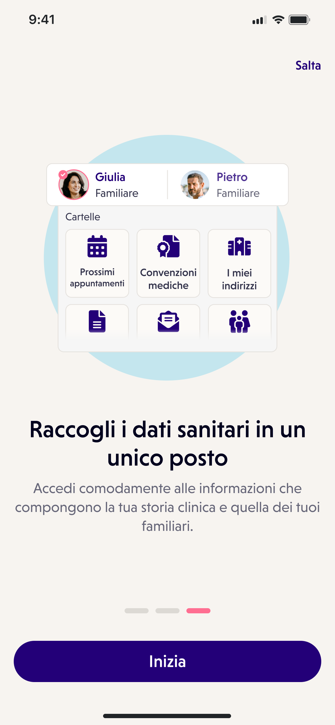
- Provided patients with easy access to medical information and resources.
- Boosted the number of patients actively using the digital care program resulting in better disease management and prevention.
- Improved user retention as a result of personalized content and tailored experience.
PERSONAL KEY TAKEAWAY (I'd never thought I'd have been able to achieve)
- I have been able to coordinate a team of UX/UI designers and developers, and no bricks collpsed
- I deepened my knowledge and understanding of the healthcare industry, allowing me to create innovative solutions.
- I've created some cool and complex flows on Miro. Something that until a few years ago I looked at and said "who knows how they do it! Who knows how much patience!" (And yes, you need a lot of patience)
- I have developed and integrated a digital care program that provides microlearning courses and personalized content to help patients manage and learn about their health.
- I HAVE COLLABORATED AND COORDINATED THE DEVELOPMENT OF NOT JUST ONE, BUT TWO APPS. Younger me, would have been so proud.